
An article about on-pack messaging? Sounds fascinating *insert ironic eyebrow raise and gentle sigh*. While retail brands have got better with what they should be saying, rather than saying everything, a walk-down supermarket aisles showcase how well brands that ‘get it’ stand out compared to brands that don’t. As the cliché goes, first impressions mean everything, but that does not mean you have to say everything.
In the pursuit of transparency and shelf appeal, many brands bury themselves in badges, claims and stickers that, ironically, confuse consumers and ultimately deter purchase. As designers, marketers and brand managers, we should break away from the habit of overloading pack designs. This does not mean being overly precious with what we do include; after all, messaging about benefits, quality, diet, and process may well help drive purchase, but rather be considered and purposeful with messaging. The goal should be finding the perfect balance between saying too little or too much.
Recent studies have found that positive claims (High Protein, Good source of calcium, etc.) are more effective than negative claims (Low Fat, No Sugar) for consumers. In the same studies, any more than two or three claims on packaging leads to confusion. Does this mean there is a ‘secret sauce’ number of claims to have on the pack? Heck no. But it does indicate that saying a lot often amounts to saying nothing at all.
So, what does this mean? For the team at Onfire, it leads to the premise that we apply to all our work, creating a story (a ‘Purpose’) rather than using prescriptive messages. Sorry, study time again, NYC-based communication agency Zeno Group surveyed over 8000 individuals across eight global territories. The conclusion? A brand with a clear story (purpose) is four times more likely to be purchased and four times more likely to be trusted. At the coal face on retail shelves, packaging should provide a consumer with clarity and simplicity. The opening statement should be a story that is memorable, easy to understand and relate to.
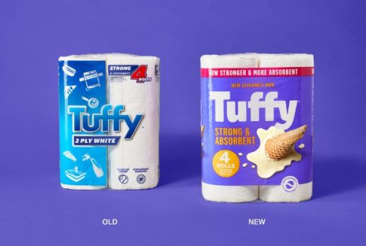
For example, Onfire’s work with the Tuffy towels team looked at how the humble paper towel fits into the lifestyle of a modern Kiwi family. In this category, brands were traditionally swallowed in various messages and callouts. Instead, we turned the volume down on tangible benefits, which enabled us to visually show the brand’s role (purpose) in the home. Bold and graphic imagery of small messes and life hacks communicate the benefits. The use of bright colours altered the tone of voice, aligning with the modern consumer and their expectations.
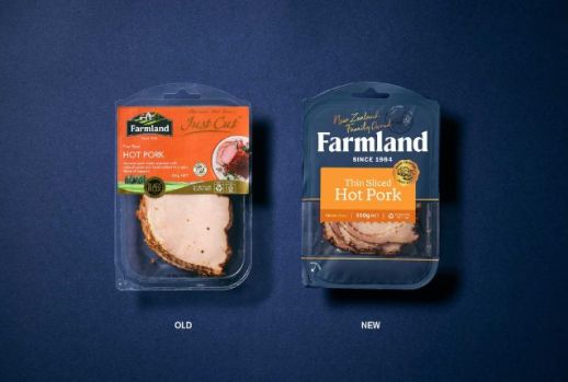
In recreating Farmland Foods, we focused on eliminating the visual clutter that years of product and sub-brand growth had accumulated, instead elevating the brand name and aligning the packaging across all formats and categories. Choosing a single Masterbrand approach allowed for single colour brand blocking, which aligned to the family’s butcher-shop heritage story and refreshing the brand logo (we were more than happy to answer the ‘can we make the logo bigger’? with a resounding yes!). The most important element is the coloured stickers. This consistent navigation device contained all the ‘essential’ information, while we eliminated messaging that could be told at other consumer touch points.
These are just a couple of examples of simplifying to amplify, embracing shelf impact, and not overloading packaging. The modern consumer is savvy. Rather than bombarding them, engage them with a story they can buy (yip, pun) into.
Want to know more about how we can help ignite your brand?
Call Sammo on 021 608 204.
Email: sam@weareonfire.co.nz
www.weareonfire.co.nz