For over 150 years, generations of Kiwis have enjoyed their favourite Harraways oats for breakfast with its distinctive yellow packaging.
So why does an iconic brand such as Harraways, need to embark on a major re-branding exercise?
“One of the most important touch points for a brand is its packaging. It is the key ‘conversion point’ that consumers truly ‘buy into’ a brand. As such Harraways needs its packaging and overall shelf presence to work as hard as possible to project the brand’s unique benefits to the shopper. Previous to the rebrand, the packs were not telling the Harraways story in the best way they could and this aspect needed to work much harder in terms of grabbing the shopper’s attention. It certainly needed addressing,” says Peter Cox, Head of Harraways Marketing and Product Development.

The rebrand has been a major part of a bigger strategic picture to grab more consumers and further build sales. Rather than trying to appeal to a diversity of groups with different needs and motivations, Harraways defined its consumer according to attitude and behaviour, rather than demographics.
Harraways also identified its brand purpose as being to satisfy contemporary consumer demand for locally grown and produced food that is real, uncomplicated, tasty and nutritious. With the shift in perception towards healthier lifestyles, Harraways job was made easier. Oats appeal to health conscious people who are aware of the many health benefits, so there was relevancy for the consumer.
Harraways worked closely on the rebrand with FMCG Brand & Packaging specialists, Marx Design. Marx understood that the brand refresh needed to appeal to new shoppers and also retain Harraways loyal customers.
“We identified that yellow was the critical link to brand familiarity. While customers identify there is a new look, yellow is the visual link to the same great product delivering great taste they’ve come to enjoy. Harraways has an incredible local history with a pioneering, bold spirit. Capturing this brand personality was critical to a successful brand refresh”, explains Ryan Marx, Creative Director, Marx Design.
“This is a revolutionary change for Harraways to evolve into a modern heritage brand. Making the brand relevant to a new shopper without losing its heartland, homegrown roots was crucial,” says Marx.
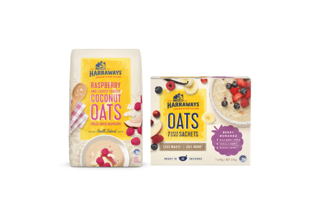
The new packaging has a charming nostalgic feel, delivering on its taste appeal. The Harraways logo lock up features the oat mill in Dunedin where some of its historical machinery is still in use today.
Local heritage is a strength for Harraways as it competes with global brands. They have both heartland and rich history from which to capitalise.
Marking a big milestone
The time was perfect for Harraways to embark on this rebrand as it celebrated a 150 year milestone during 2017, so from that recent event there was plenty of known historic material and unique assets to work with. It was a faded, iconic Harraways oat sack from the company’s early years that gave the Marx team the pivotal inspiration for a unique and ownable modern heritage font direction.
Harraways has kept the business local and supports its Otago/Southland roots. This stretches from sourcing oats to employing locals at its mill. It is important to celebrate the longevity of a local business and Harraways is proud to highlight this on its packaging.
Sustainability was also a massive part of the Harraways rebrand. The underlying message being that Harraways is very conscious about how its oats are packaged and every bit – done responsibly – helps the planet.
Harraways Quick Serve Sachets now come in a more resourceful box with 20% less cardboard used, so there is less packaging waste. Made from sustainable wood pulp, the box is 100% recyclable. The new 45g quick serve sachets contain 20% more oats per serve and the sachets are made with home compostable material.
“The scope of this project was exciting. It’s a privilege to work with such rich history and iconic brand architecture. Harraways knew what it had to do for continued growth and let us do our job. This modern heritage brand evolution will position the Harraways brand for continued growth and relevancy,” says Janine Bickerton, General Manager, Marx Design.